We are in the process of picking out new countertops and backsplash, which will change the entire look and feel of our kitchen... kinda scary! So afraid to pick wrong!
We have white cabinets, dark brown hardwood floors, black/stainless steel appliances.
I'm being drawn to pictures where the counters are dark and the backsplash is white... very clean and simple...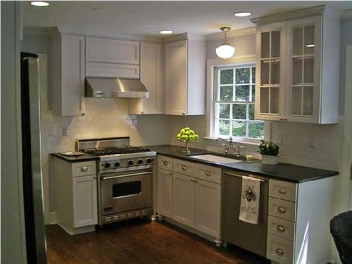
love the pattern in this one...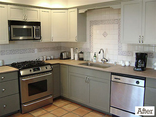
this is simply adorable...
very clean looking...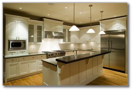
this is beautiful...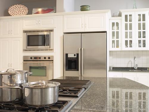
but I *think* this one is my fave with just a touch of color instead of pure white...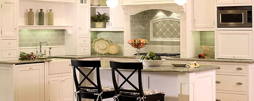
Which one is your favorite?
Thursday, January 14, 2010
kitchen inspiration
Posted by
erin
at
8:28 AM
![]()
Subscribe to:
Post Comments (Atom)










59 comments:
i like the last one. i like the look of white with a touch of color :]
I agree with you. the last one with that little tint of green is amazing.
I like the first one, but I think the last is my favorite as well. It's clean with just a hint of color without being overwhelming.
How do you like the hardwood floors in your kitchen? We're getting wood put down in the living room, dining room & entry way this Spring. I'm lobbying for the kitchen as well, but I'm losing the argument.
I like dark counters with white backsplash. More classic and less trendy and will stand the test of time, I think.
I think you should do a white subway tiled backsplash with black granite counters. Love that look! It's so timeless. I'm ryingto talk my hubby into doing that to our backplash. Maybe put a light sea green or aqua on your walls (or just the ceiling) instead or in the accessories?
These are my 3 favorite kitchens, you should take a peek.
http://megduerksen.typepad.com/whatever/2010/01/before-and-after.html
http://www.flythroughourwindow.com/2008/04/house-renovation-part-4-kitchen-fr/
http://memoriesoncloverlane.blogspot.com/search/label/House%20Before%20and%20After
LOVE LOVE LOVE white! Especially the 1st, 3rd and last ones!!! I am actually doing the same but and taking a CHEAP route since we want to sell SOON! I'm using the Rustoleum countertop paint...hopefully this weekend!!!
the yellow one, for sure! :)
I love the "clean" one. There was a black and white kitchen on Divine Design once that I LOVED.
I do love the little touch of color though... What a tough decision!
Just a splash of color is good!!
we too are getting ready to GUT our entire kitchen, I am too scared to do white with kids, but I love the look of it! We are doing an apron front farm sink...I love the pic of yours with the little bit of green, love the subway tiles...your taste in jewelry is great, so will your taste in your kitchen, good luck!
First is my favorite. I love the reflective quality of the black granite. I have heard it is a bit of work to keep looking spotless. But love the subway tile too. You can always pop color with accessories and they are easier to change than tile.
Lori
The 1st FOR SURE! The dark counters against the white is gorgeous!
They're all beautiful, but I think my fav is also the last one.
Have fun picking out your new kitchen...
you will be so happy that you added a bit of color. you can play it up, or keep it simple. nice taste (glad you are making my jewlery!)
have fun!
Ours is very similar to the 4th picture, but we used some sea glass and tumbled travertine for the back splash. We have the black granite and it's a BEAR to keep clean ALL.THE.TIME. with 2 small kiddos. If you do black, do the "honed" (sp?) black granite. The same look, minus the fingerprints. It's so exciting to remodel! Good luck!
#1. love it
They're all great! We have slightly off white cabinets with a slightly off white subway tile backsplash and darker counters and we get compliments on it ALL the time! It is a great combo! Plus subway tiles clean up really well! Have fun with your remodel!
I'm with you - the last one is my fave. What I really love about many of the ones you picked (in regard to the backsplash) is the "subway tiles" {rectangle-shaped tiles}. I have always loved that look. Timeless, yet unique.
We need a backsplash too!! We built our house, but some of the downsides of that is that we left some things unfinished because we "couldn't make up our mind..." well... we haven't been able to for 3 years! LOL We are leaning toward doing some sort of subway tile.
I also like dark countertops. Can't go wrong with that!
The last one! :) !
I LOVE a clean, classic look. I think I would just accessorize with some colorful pieces or pictures that you could easily change out when the mood strikes you!!
THe last one is my fav! although, they are all beautiful. So hard to decide on remodels. Good luck!
I like the last one with the sage green tile backsplash but the first one would be easy to change up if you got bored with the decor just by adding new accent colors. It would match anything.
I like the last one too! But remember that you can always add color with decorations, so better to go more neutral on the tile because you'll probably never change it again. Just a thought. :-)
I like the splash of color! :) i love the green! :)
though i've always dreamt of having my own kitchen with red tiled backsplash, the yellow one is very sweet and charming, too!
I like the first the best. I like the idea of maybe a splash of color but I've been watching The Biggest Bang for your Buck on HGTV long enough to know that classic white subway tiie paired with the elements you described creates the exact classic kitchen look that holds and increases it's resale value best.
I like the first one with the subway tile and the black counters! they're all beautiful though!
I love the black and white look! I have been dreaming of building ever since we sold our house and have been drawn to black and white
the last one with a touch of color is my favorite as well...best of wishes making fun decisions!!!
Love the last 2. I really like the pop of green, but there's something about the one before that ~ maybe its the glass doors. I'm a sucker for glass doors.
Oh my. A white kitchen makes me so happy. I love the next to last one for all its crispness. BUT I am also a color person, so I definitely love pops of color.
I love the sink in the 3rd picture, but they are all pretty!
I would go for the white subway tiles and a dark stone countertop. Soapstone is VERY cool. It was used in colonial homes and is still used today. Verde Butterfly granite is what I have and it is glorious. It has garnet flecks in it, but basically is a dark top, has a black look to it and has a lot of green in it. ANY color I have put in my kitchen matches it. It is neutral without being "beige". I hate beige countertops.
I like a splash of color, but you can always use the splash of color in the decorating and keep the actual "slate" neutral, that way you don't have to re-do the whole kitchen if you get sick of the one color.
Hi Erin,
They are all lovely. Not sure this will help but I have timber floors (slightly lighter they are spotted gum) white cupboards (with a kind of gloss too them) a black granite bench top and glass splashback. I have a pale green behind mine, but you can pretty much have any paint colour you like behind them. I am in Australia though, I assume you can get glass splashbacks there too.
Erin,
Congratulations on re-doing your kitchen. It is a big decision, but it's also a lot of fun. My personal favorite is the final pictue. I think th green adds just the right touch with the white cabinets. Good luck!
they are all great...but the ones that stand out...first, fourth and last one...the subway tile is my favorite!
The last two are my favorite. A good blend of traditional and modern styles. I love white kitchens.
I like the last one the most. Not that you asked, but I'm going to throw it out there...regarding dark/black countertops, they are beautiful--when they are pristine and clean. I would go with something dark, but enough variation to disguise streaks and fingerprints...from one who learned the hard way ;)
As soon as I saw the last one, I said Wow! Definately my fav!
Although I do love clean & Simple, the last one is calling my name. It is gorgeous with that hint of color!!
I love the white cabinets with the grey countertop and the eggshell walls with the pops of color in the accessories.
i've always had a soft spot for subway tiles (like the one you have posted with the hints of yellow). i say go with that!! :) <3
I like the bottom pic with the color of green to it. It helps brighten the kitchen. Good luck!!!!
Any of them would be perfectly beautiful, but the last one is probably the best. Very pretty.
I would go with a mix of #1 and the last one. A dark grayish countertop with similiar (maybe a touch lighter) backsplash with the subway tiles. :)
I love the yellow one. I just ordered a necklace and I'm so excited! I've been wanting to order forever but we weren't sure what to name our 2nd baby. He's here though and we settled on Harper. Thanks in advance! :)
I LOVE the 1st and 2nd look! I would go with the white and instead use accessories to add a punch of color to your kitchen! Accessories are easily replaceable if you decide that you want a change, but with a backsplash you will be stuck for a while so make sure that color is still fairly neutral!
That last one is GORGEOUS!! I love it!
And I totally dig the dark counters with white everything else. It looks so crisp and clean.
The last one is my favorite.
It is scary (I'm a decorator and I find it scary lol), but have fun and enjoy the process!
Last one for sure!
I have white cabinets in my new house & love them! My counters & backsplash are the color of light sand, which I didn't like at first, but now I love it too!
That farm sink is wonderful...but my favorite of your choices here is the last one.
Check this one out - this is the shot I took with me when choosing things for my kitchen:
http://tinyurl.com/ydyhptx
lovin the last one.
Love them all but my fave is the very first one. I like the dark floors how they contrast w/ the white and then I LOVE the white subway tile backsplash. I would love that entire kitchen to be mine. :)
We just redid ours a couple years ago on a very small budget. We did white cabinets, dark countertops, and I am a sucker for subway tile. I love the green too but was afraid as much as I change my mind and re-decorate, I would regret the color, so I went with brown... it's ceramic and almost looks hand-done and it turned out gorgeous! Lowe's has the green and the brown to special order... you should check it out!
Definitely the last one with the touch of color. Love it!
The last one with the adorable sink in the third one! I'd take the third one with the sink. LOVE IT...
I heart subway tiles! We just put them in our master bath shower.
I really like the first kitchen. I am a sucker for white cabinets and dark countertops.
p.s. I really like your playlist. :)
Post a Comment